The colors picked out of the glossy pages of a lifestyle magazine do not always translate well when it comes to the home decor.
A gorgeous shade of brown from a design magazine might turn out to be dull and make your space look dark and cramped.
Colors play an integral part in your home decor. Picking the right color palette is not an easy task.
It depends on the size and location of your rooms, the lighting, the layout and even the furnishings you own.
It’s important to get your color schemes narrowed down at the start of your design process.
Find this too challenging? It really needn’t be, we have you covered. Here are some basic rules to help you choose a color palette that’s perfect for your home.
Dark colors vs. light colors
While choosing a color for your home interiors think of the colors in the rainbow.
Colors that are closer to red have longer wavelengths. They feel like they are ‘advancing’ toward you.
On the other hand, colors that are closer to violet feel like they are ‘receding’ away.
Then again, darker colors seem to advance and lighter shades will recede.
If you want your room to look larger, you should use shades that are similar to light blue, pale green or white.
Intensely dark shades of red, brown, orange will make your room appear small and cramped.

Pure colors draw attention
A pure color seems to advance more and instantly draws the eye. While colors that are a combination of two or more pure shades, tend to recede and fade into the background.This can be used to advantage when you are trying to create a focal interest in the room with your wall art.
Pure shades will always stand out and draw attention.
Colors are affected by the surroundings
A color will always be viewed together with the colors around it. Keep in mind, the shades that are close to each other on the color wheel are complementary.
They are called analogous colors. While the shades that are at opposite ends of the wheel contrast each other.
For instance, a room done up in green, blue and yellow shades will be in harmony as they complement each other.
Green and red do not go very well as they are on opposite sides of the spectrum.

Colors affect your mood
It’s a well-known fact that colors affect your mood. That is all the more reason for you to choose your color palette with care.
As a rule of thumb, shades of blue, green and generally all pastel shades are soothing and relaxing.
While shades of red, orange and yellow are invigorating and lively. Your design scheme should always strike the right balance and create harmony in your home interiors.
Try to use colors in moderation. Too much red, for instance, can get uncomfortable after a while.
On the other hand, too much pale blue could be overwhelmingly dull. Here’s an easy fix:
try balancing a red accent wall with pastel color wall art to tone down the vibrancy.
Colors look different when the light changes
Color takes on different qualities when viewed in sunlight versus when viewed under artificial light. Make sure you run patch tests to see how your chosen shades look in the daytime and at night.
Bright sunshine goes well with shades of yellow, amber and orange. While blues and greens look their best in cool diffused white light.
When you are choosing the colors for your home interiors, keep in mind the positioning of windows and lights in the room.
Choose the hues to suit the intensity and quality of the light in the room.

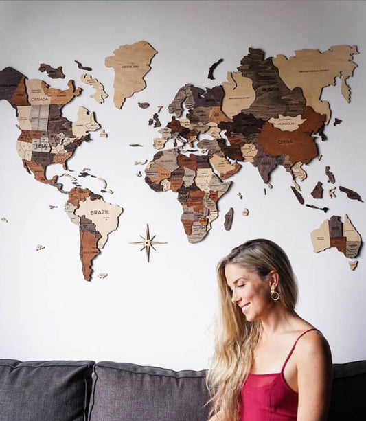
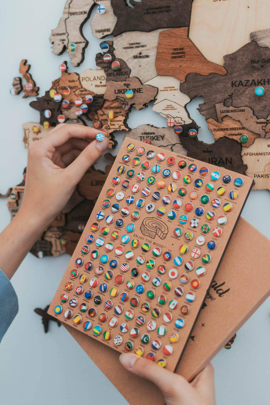
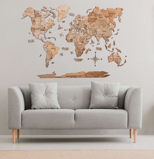
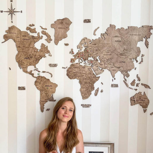
Choose wall art wisely
Wall art is a key component of your home decor. We can agree on that, right?
Choosing the right color can elevate your room and create a focal point right away. Just like the Wooden World Map on the example photo above.
Generally natural, earthly shades are matching with most interior design.
Most likely you already have brown in your decor, in the shape of your furniture.
If you're lucky enough to find a similar color for your wall art, you just hit the jackpot.